Showing posts with label Impressionism. Show all posts

Monday, September 5, 2011

My Teachers: Monet, Cezanne, and Vincent van Gogh

I realized today--as I was looking at the works of two of my Teachers, Monet and Cezanne, that I need to add more dark blue into my greens, when I want them to be darker.
Of course I knew this because on the color wheel green darkens to blue-green and then goes to blue. I knew this and yet when painting I wasn't fully utilizing the theory.

I like Monet's (an Impressionist) use of the brush--his paint handling, and his use of optical mixing such as when he puts yellow and red next  to each other to make an orange. Optical mixing was one of the innovations of the Impressionists.


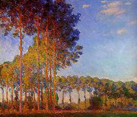
In this painting by Monet we can clearly see his use of blue to create shadow and model form.

What I like about Cezanne ( a Post-Impressionist) is his more formal structure in his paintings--the forms help the painting hold together and not become soupy. (Monet often creates a soup--but what beautiful soup he makes!)  There is an underlying strength in Cezanne's compositions. I also like how Cezanne blurs the edges of trees and rocks so that he is not creating those blasted outlines that Vincent van Gogh often used. Cezanne also softens his "outlines" by using dark blue rather than black and since blue is a cool color the edge recedes in the picture plane thus rounding the form. Cezanne is a Master of using warm colors to cause his forms to advance on the picture plane (the surface of the canvas) and cool colors to cause his forms to recede on that same picture plane.


Look at Cezanne's strong composition and his use of dark blue to create shadow!

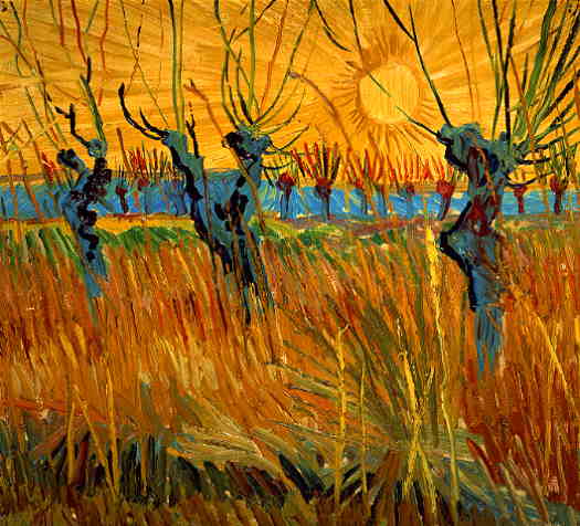
Since I criticized Vincent's use of the black outline I will say that every painter can learn from him about the use of vibrant, complementary colors; the technique of impasto--which gives such a rich texture to a painting; and probably most important of all Vincent (a Post-Impressionist) put feeling into his works. Vincent--one of my favorite artists of all time--could make a flower look as though it was weeping or singing.


 Vincent van Gogh here uses a lighter, but still cool, blue to show the shadowed side of the willows and some shadow in the tall grasses at their base.

 These three, Claude Monet, Paul Cezanne, and Vincent van Gogh are my current teachers. I could add Mark Rothko but that will have to wait for another day.


In this painting I (Daniel Balter) used some blue in the shadowed areas of the trees but I could have used more.


In this painting I (Daniel Balter) almost completely forgot to use blue--I am still learning!


Sunday, September 4, 2011

Extreme Painting!

Painting in the dark is a challenge!


This is my first plein-air (open-air) night painting. 

 I am wearing an Energizer 4 LED Headlight and used my Guerrilla Painter ThumBox to carry my paints, palette, and canvas boards.

The painting site was my spot along the Willamette River in Eugene Oregon.

I rode my bike along the bike trail to reach the site and passed a 1000 houses from which I could see emanating the blue-glow of TV and computer screens.

It felt good to be outside, on a special mission to capture a scene.

Sometimes I pretend that I live in a time where there are no cameras and the only way I can capture a scene is by creating, by hand, images.

Sometimes I pretend that I was born without the ability to speak words and the only way I can communicate is through images.

I love painting and I love being outside and this is what drives me to go outside in the open-air to paint--
even in the dark!


Friday, September 2, 2011

Cezanne's Carrot

Paul Cezanne, one of the great Post-Impressionist painters, once said, "With an apple I will astonish Paris."

He is also reported to have said,“The day is coming when a single carrot, freshly observed, will set off a revolution.”

Cezanne did indeed astonish Paris and set off a revolution; and he is now considered the Father of Modern art.

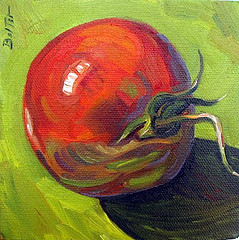
I used Cezanne's methods of using warm and cool colors to create form (warm colors advance on the picture plane and cool colors recede), when I painted this tomato.

For example, instead of using black to create shadow, I used cool greens, cool dark blue; and a cool red for a complementary color in the green shadow.
Also, I also used a violet (a cool color) under the edge of the tomato to push back the bottom edge.

See Impressionist color theory online for more information of this fascinating topic.


I am no Paul Cezanne and I painted a tomato rather than an apple, but I think that my painting is better off for having been painted in a Post-Impressionist manner.
Thank you,Paul Cezanne for your contribution to art.

You can purchase this painting by direct email to me at mailto:dkbalter@comcast.net or on my Etsy shop account:.net


Wednesday, August 31, 2011

The Double Primaries Palette

 I am a plein-air (open-air) painter and usually find my "Painting Stations" while on bike. Consequently I need to travel lightly. I use a Guerrilla Painter ThumBox, a pochade box.  See the photo below:
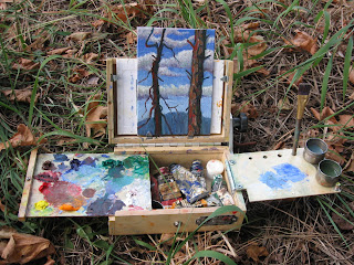
Pochade box in action


Pochade box folded

I can carry only a minimal amount of tubes of paint. This compactness of the pochade box has led me in an ongoing search for the minimal amount of tubes of paint to take with me.

At first I tried a so-called Beginners, or Basic Palette which consisted of Thalo Green, Ultramarine Blue, Thalo Blue, Alizarin Crimson, Lemon Yellow, Cadmium Yellow Medium, Cadmium Red Light, Yellow Ochre, Burnt Sienna, Burnt Umber, and Titanium White. However that was 11 tubes of paint--too much; my little pochade box was packed!

Furthermore, I am a  fan of the Impressionists and wanted to paint in a Neo or Post-Impressionist manner.

So, I looked up Monet's palette and it is said that he used these colors: Chrome yellow (the modern equivalent is Cadmium Yellow Light) ,Cadmium Yellow ,Viridian Green, Emerald Green, French Ultramarine Blue, Cobalt Blue, Madder Red (modern equivalent is Alizarin Crimson), Vermilion (or Cadmium Red Light) and Ivory Black (Black only if you're copying a Monet from before 1886--he later banished the black).
That is 9 tubes--not bad!
The following link is to Monet's palette info and his painting techniques, etc.
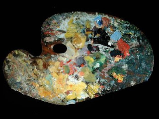


Monet's palette

So, to sum up Monet's palette, he used a light and dark version of the primaries of red, yellow and blue as well as a light and dark green; with the addition of white.

With these colors one can make every color that is found in nature. These are the rainbow colors that are found in refracted light.

Yet, I found I could cut even more tubes of paint if I used what is called The Double Primaries Palette.
The double Primaries Palette consists of a warm and cool version of each of the primary colors: red, yellow, and blue. One can make their own greens, dark and light, as well as browns and oranges and purple.


The Double Primaries Palette
Simply click on this thumbnail to see the colors listed.


All the tubes I need for The Double Primaries Palette.

 Instead of Thalo Blue Tint I can use a Cobalt Blue and make it into a tint by adding a little white.

The Double Primaries Palette that I am now using is, RED: Cadmium Red Light, Alizarin Crimson, YELLOW: Cadmium Lemon Yellow, Cadmium Yellow Medium, BLUE: Cobalt Blue (tint), and French Ultramarine Blue. Plus Titanium white.
That is 7 tubes of paint!
As I experiment and learn more about color I will share it here. To see my paintings one can go to my Flickr photostream at http://www.flickr.com/photos/43692916@N03/

Now, let's go paint!

Saturday, August 20, 2011

Cezanne's Apples and the Tree-Forms of The Forest


I like painting trees because they are such strong forms. I painted these trees while visiting my parents on their woodland estate.

About.com, under the heading of art history, defines form as "Form is an element of art. At its most basic, a form is a three-dimensional geometrical figure (i.e.: sphere, cube, cylinder, cone, etc.), as opposed to a shape, which is two-dimensional, or flat." http://arthistory.about.com/cs/glossaries/g/f_form.htm

The About.com definition is a basic and well accepted one, but creating form in art has been approached from a couple of different angles.

As an example of one method, I used to create form by painting each object, in a painting, a local color ( e.g., a red apple), then I  highlighted  and shaded the object by lightening and darkening that local color: making light red for the highlight and dark red for the shadow. Often I lightened the red by adding white and darkened the red by adding black.

However, there is another way to create form; rreferring to this way, Lois Griffel, in her enlightening book, Painting The Impressionistic Landscape: Lessons In Interpreting Light And Color quotes her teacher Charles Hawthorne. He says, "Let color make form, do not make form and color it in. Work with your color as if you were creating mass--like a sculptor with his clay." ( Charles Hawthorne was the founder of the Cape Cod School of Art which taught the Impressionist methods.)

To see--perhaps the best-- examples of this technique of creating form, I suggest looking at Paul Cezanne's still lifes that contain apples. You will see how Cezanne sculpts the apple by using warm colors such as red and yellow to advance the form toward the viewer and cool colors such as violet, green, and blue to cause the form to move away from the viewer. No wonder Cezanne once declared "With an apple I will astonish Paris!" http://thinkexist.com/quotation/with_an_apple_i_will_astonish_paris/259340.html

In the trees and shadows of my tree painting above I use a cool version of  red, blue, and a muddy purple to push them back a bit and distinguish their forms from the bright yellow light. I like the painting but realize that I still have a lot to learn.

I will go now and peer at Cezanne's apples, hoping to learn from the Master.


Thursday, August 4, 2011

A Flower Kicked My Butt!


Monet once said that if it were not for flowers he probably wouldn't have become a painter.

I can understand that kind of love for the beauty of the flower, but what Monet didn't say--at least not as a quoteable quote--is that the flower can kick your butt.

This flower kicked mine.

I have a feeling that I will be painting many more flowers.

I painted this flower on Thursday, 08-04-2011, using a palette knife to apply oil paint to a 6" x 6" masonite panel.


Tuesday, August 2, 2011

Knife Attack!

Last night, I did two paintings: one was very small (2" x 2 3/4"), which I overworked and the other was slightly larger 4" x 4' and turned out better, being stronger and abstracted.

I painted both of the paintings with a palette knife--no brushes!

I hunched over the smaller sized painting for almost an hour and consequently put in too much detail,
then, as I was packing up, the sun dropped even lower over the hills and the sky turned a burnt orange with some reddish scatttered patches; the hills went from a greyish-orange to a blue color.

I couldn't walk away from that!

I dug through my pack and pulled out a 4" x 4" wooden art panel and began slashing at it with my palette knife.

At first I didn't even care whether or not the painting worked out, but when it did begin working my main concern was to stay out of the way and let it just develop.

Finally, I reached the point where I dare not touch it and I knew I was done.

I packed the finished paintings into a cigar box and rode away.
Behind me the hills had turned into dark sillouttes and there was only a slight pinkinsh color in the Prussian blue sky.
The air smelled of mint, lavender, and freshly cut hay and grass.

I felt happy as I rode my bike with my paintings packed safely on the back. Happy that I had decided at the last minute to ride out into the West Eugene Wetlands to paint the sunset.


The first, smaller painting.


The second painting.


Thursday, July 21, 2011

Monet's Children


Today, I went out to paint en plein air--in the open air--and I was very disappointed with the little painting I made. It was covered in cliche and powedery looking, as if I used baby powder on it instead of Sennlier pastels.

Finally, I packed up my gear and headed for home, wondering why I hadnt become a plumber or something besides an artist. Maybe I am just not a landscape painter, I thought as I felt grey clouds form in my mind.

I got home and watched a Mark Rothko documentary on YouTube while eating a TV dinner--I was trying to make myself feel better.

After the documentary I walked out onto the porch and I saw the sunset. My mouth dropped open and I rushed for my pastels. They were nearby on the bed and I grabbed a handful of them and started  in.

If the neighbors had looked out their window they would have seen a bearded man staring into the sun chattering and scribbling furiously all over a piece of colored paper. I was chasing the light! 

 I didnt have time to think about establishing a good composition or values or even underpainting--I was racing.

When I was done and the sun was down over the trees I looked at my little painting and smiled.

I am an artist, I thought, why did I ever doubt?


 To Monet, who chased the light and found it--I salute you!

This painting, as most of my others, looks a lot better on Flickr. To see my photostream just go to Flickr and look up Daniel Balter. http://www.flickr.com/photos/43692916@N03/

Wednesday, July 20, 2011

Process-Painting: Sunset City


Sunset City: Oil on canvas 6"X6"
I wanted to show you all the process, some of the steps, that go into making a painting.

The above photo is the finished product, but the following photos show where I started and how I progressed.


1


2


3


4

5


6


7-the finished painting.

This painting started out as a "mentor painting"--which means I was transcribing it from one of the modern Masters but I added some final touches to make it my own. The Master was Tom Brown whose style and prolific output is inspiring. He sells DVD's that teach his style of painting which is Modern Impressionist but I can't afford, right now, the DVD. 

Many of the old Masters practised transcribing the works of the Masters that went before them; for example Vincent van Gogh transcribed the paintings of Delacroix, Millet, and many others. Some of Vincent van Gogh's most famous poaintings are actually his transcriptions of Millet paintings.
Vincent's "Sower"--which he painted many times-- is an example.

As I continue to learn I will continue to share and thank those who are showing me the path.