Showing posts with label color theory. Show all posts

Monday, September 5, 2011

My Teachers: Monet, Cezanne, and Vincent van Gogh

I realized today--as I was looking at the works of two of my Teachers, Monet and Cezanne, that I need to add more dark blue into my greens, when I want them to be darker.
Of course I knew this because on the color wheel green darkens to blue-green and then goes to blue. I knew this and yet when painting I wasn't fully utilizing the theory.

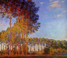
I like Monet's (an Impressionist) use of the brush--his paint handling, and his use of optical mixing such as when he puts yellow and red next  to each other to make an orange. Optical mixing was one of the innovations of the Impressionists.


In this painting by Monet we can clearly see his use of blue to create shadow and model form.

What I like about Cezanne ( a Post-Impressionist) is his more formal structure in his paintings--the forms help the painting hold together and not become soupy. (Monet often creates a soup--but what beautiful soup he makes!)  There is an underlying strength in Cezanne's compositions. I also like how Cezanne blurs the edges of trees and rocks so that he is not creating those blasted outlines that Vincent van Gogh often used. Cezanne also softens his "outlines" by using dark blue rather than black and since blue is a cool color the edge recedes in the picture plane thus rounding the form. Cezanne is a Master of using warm colors to cause his forms to advance on the picture plane (the surface of the canvas) and cool colors to cause his forms to recede on that same picture plane.


Look at Cezanne's strong composition and his use of dark blue to create shadow!

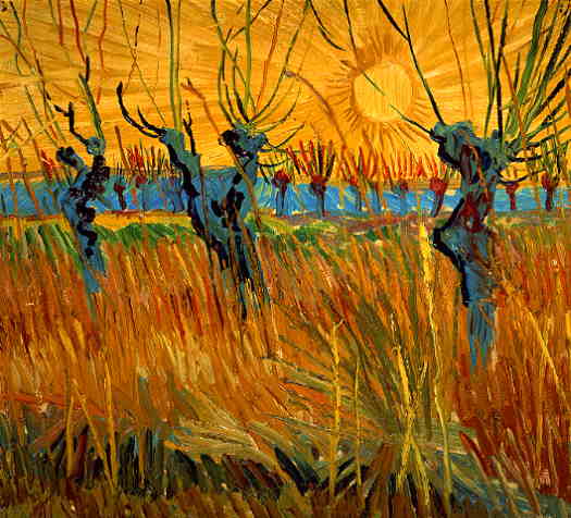
Since I criticized Vincent's use of the black outline I will say that every painter can learn from him about the use of vibrant, complementary colors; the technique of impasto--which gives such a rich texture to a painting; and probably most important of all Vincent (a Post-Impressionist) put feeling into his works. Vincent--one of my favorite artists of all time--could make a flower look as though it was weeping or singing.


 Vincent van Gogh here uses a lighter, but still cool, blue to show the shadowed side of the willows and some shadow in the tall grasses at their base.

 These three, Claude Monet, Paul Cezanne, and Vincent van Gogh are my current teachers. I could add Mark Rothko but that will have to wait for another day.


In this painting I (Daniel Balter) used some blue in the shadowed areas of the trees but I could have used more.


In this painting I (Daniel Balter) almost completely forgot to use blue--I am still learning!


Wednesday, August 31, 2011

The Double Primaries Palette

 I am a plein-air (open-air) painter and usually find my "Painting Stations" while on bike. Consequently I need to travel lightly. I use a Guerrilla Painter ThumBox, a pochade box.  See the photo below:
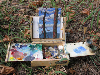
Pochade box in action


Pochade box folded

I can carry only a minimal amount of tubes of paint. This compactness of the pochade box has led me in an ongoing search for the minimal amount of tubes of paint to take with me.

At first I tried a so-called Beginners, or Basic Palette which consisted of Thalo Green, Ultramarine Blue, Thalo Blue, Alizarin Crimson, Lemon Yellow, Cadmium Yellow Medium, Cadmium Red Light, Yellow Ochre, Burnt Sienna, Burnt Umber, and Titanium White. However that was 11 tubes of paint--too much; my little pochade box was packed!

Furthermore, I am a  fan of the Impressionists and wanted to paint in a Neo or Post-Impressionist manner.

So, I looked up Monet's palette and it is said that he used these colors: Chrome yellow (the modern equivalent is Cadmium Yellow Light) ,Cadmium Yellow ,Viridian Green, Emerald Green, French Ultramarine Blue, Cobalt Blue, Madder Red (modern equivalent is Alizarin Crimson), Vermilion (or Cadmium Red Light) and Ivory Black (Black only if you're copying a Monet from before 1886--he later banished the black).
That is 9 tubes--not bad!
The following link is to Monet's palette info and his painting techniques, etc.
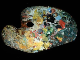


Monet's palette

So, to sum up Monet's palette, he used a light and dark version of the primaries of red, yellow and blue as well as a light and dark green; with the addition of white.

With these colors one can make every color that is found in nature. These are the rainbow colors that are found in refracted light.

Yet, I found I could cut even more tubes of paint if I used what is called The Double Primaries Palette.
The double Primaries Palette consists of a warm and cool version of each of the primary colors: red, yellow, and blue. One can make their own greens, dark and light, as well as browns and oranges and purple.


The Double Primaries Palette
Simply click on this thumbnail to see the colors listed.


All the tubes I need for The Double Primaries Palette.

 Instead of Thalo Blue Tint I can use a Cobalt Blue and make it into a tint by adding a little white.

The Double Primaries Palette that I am now using is, RED: Cadmium Red Light, Alizarin Crimson, YELLOW: Cadmium Lemon Yellow, Cadmium Yellow Medium, BLUE: Cobalt Blue (tint), and French Ultramarine Blue. Plus Titanium white.
That is 7 tubes of paint!
As I experiment and learn more about color I will share it here. To see my paintings one can go to my Flickr photostream at http://www.flickr.com/photos/43692916@N03/

Now, let's go paint!