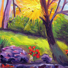
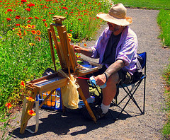
Showing posts with label plein-air painting. Show all posts

Monday, September 5, 2011

My Teachers: Monet, Cezanne, and Vincent van Gogh

I realized today--as I was looking at the works of two of my Teachers, Monet and Cezanne, that I need to add more dark blue into my greens, when I want them to be darker.
Of course I knew this because on the color wheel green darkens to blue-green and then goes to blue. I knew this and yet when painting I wasn't fully utilizing the theory.

I like Monet's (an Impressionist) use of the brush--his paint handling, and his use of optical mixing such as when he puts yellow and red next  to each other to make an orange. Optical mixing was one of the innovations of the Impressionists.


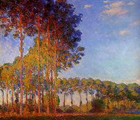
In this painting by Monet we can clearly see his use of blue to create shadow and model form.

What I like about Cezanne ( a Post-Impressionist) is his more formal structure in his paintings--the forms help the painting hold together and not become soupy. (Monet often creates a soup--but what beautiful soup he makes!)  There is an underlying strength in Cezanne's compositions. I also like how Cezanne blurs the edges of trees and rocks so that he is not creating those blasted outlines that Vincent van Gogh often used. Cezanne also softens his "outlines" by using dark blue rather than black and since blue is a cool color the edge recedes in the picture plane thus rounding the form. Cezanne is a Master of using warm colors to cause his forms to advance on the picture plane (the surface of the canvas) and cool colors to cause his forms to recede on that same picture plane.


Look at Cezanne's strong composition and his use of dark blue to create shadow!

Since I criticized Vincent's use of the black outline I will say that every painter can learn from him about the use of vibrant, complementary colors; the technique of impasto--which gives such a rich texture to a painting; and probably most important of all Vincent (a Post-Impressionist) put feeling into his works. Vincent--one of my favorite artists of all time--could make a flower look as though it was weeping or singing.


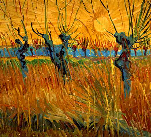
 Vincent van Gogh here uses a lighter, but still cool, blue to show the shadowed side of the willows and some shadow in the tall grasses at their base.

 These three, Claude Monet, Paul Cezanne, and Vincent van Gogh are my current teachers. I could add Mark Rothko but that will have to wait for another day.


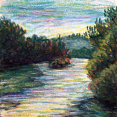
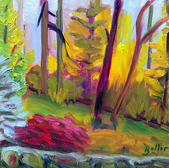
In this painting I (Daniel Balter) used some blue in the shadowed areas of the trees but I could have used more.


In this painting I (Daniel Balter) almost completely forgot to use blue--I am still learning!


Wednesday, August 31, 2011

The Double Primaries Palette

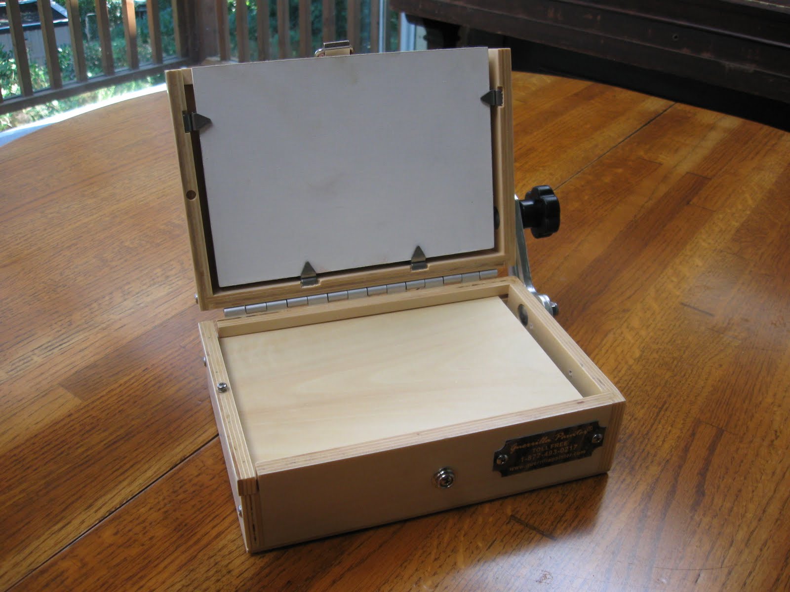
 I am a plein-air (open-air) painter and usually find my "Painting Stations" while on bike. Consequently I need to travel lightly. I use a Guerrilla Painter ThumBox, a pochade box.  See the photo below:

Pochade box in action


Pochade box folded

I can carry only a minimal amount of tubes of paint. This compactness of the pochade box has led me in an ongoing search for the minimal amount of tubes of paint to take with me.

At first I tried a so-called Beginners, or Basic Palette which consisted of Thalo Green, Ultramarine Blue, Thalo Blue, Alizarin Crimson, Lemon Yellow, Cadmium Yellow Medium, Cadmium Red Light, Yellow Ochre, Burnt Sienna, Burnt Umber, and Titanium White. However that was 11 tubes of paint--too much; my little pochade box was packed!

Furthermore, I am a  fan of the Impressionists and wanted to paint in a Neo or Post-Impressionist manner.

So, I looked up Monet's palette and it is said that he used these colors: Chrome yellow (the modern equivalent is Cadmium Yellow Light) ,Cadmium Yellow ,Viridian Green, Emerald Green, French Ultramarine Blue, Cobalt Blue, Madder Red (modern equivalent is Alizarin Crimson), Vermilion (or Cadmium Red Light) and Ivory Black (Black only if you're copying a Monet from before 1886--he later banished the black).
That is 9 tubes--not bad!
The following link is to Monet's palette info and his painting techniques, etc.


Monet's palette

So, to sum up Monet's palette, he used a light and dark version of the primaries of red, yellow and blue as well as a light and dark green; with the addition of white.

With these colors one can make every color that is found in nature. These are the rainbow colors that are found in refracted light.

Yet, I found I could cut even more tubes of paint if I used what is called The Double Primaries Palette.
The double Primaries Palette consists of a warm and cool version of each of the primary colors: red, yellow, and blue. One can make their own greens, dark and light, as well as browns and oranges and purple.


The Double Primaries Palette
Simply click on this thumbnail to see the colors listed.


All the tubes I need for The Double Primaries Palette.

 Instead of Thalo Blue Tint I can use a Cobalt Blue and make it into a tint by adding a little white.

The Double Primaries Palette that I am now using is, RED: Cadmium Red Light, Alizarin Crimson, YELLOW: Cadmium Lemon Yellow, Cadmium Yellow Medium, BLUE: Cobalt Blue (tint), and French Ultramarine Blue. Plus Titanium white.
That is 7 tubes of paint!

As I experiment and learn more about color I will share it here. To see my paintings one can go to my Flickr photostream at http://www.flickr.com/photos/43692916@N03/

Now, let's go paint!

Wednesday, August 24, 2011

Guerrilla Painter ThumBox

I used to carry, out into the field, the wild open-air, a French Easel, which is as heavy as carrying a Toyota Prius on one's back.

Here is a photograph of me using the French Easel:


Since I already have a bad back this was unendurable.
Consequently, I felt empathy for Vincent van Gogh and Monet and Pissarro and the rest of the herioc Masters of En Plein-air--the painters of the open-air.

I finally broke down and bought a small, modern day version of the pochade box.The pochade box according to Wetcanvas.com, "...is a compact, portable painting studio in a small box. "Pochade" is a French word meaning "quick (color) sketch...Traditional pochade boxes were characterized by three simple elements: A hinged lid which functions as an easel and wet painting carrier, a palette which slides out to one side, and the lower portion of the box which contains paints and brushes...These ingenious, old-fashioned devices were used extensively by 18th and 19th century landscape painters...The pochade box...was originally designed to be used for performing plein air 'studies', which are smaller, and less detailed than a finished painting...."http://www.wetcanvas.com/Articles2/5946/234/
I bought a Guerilla Painter ThumBox which is a pochade box. It is an awesome implement in the plein-air painter's repertoire.

Here are some photos of my Guerilla Painter Thumbox:


And my Guerilla Painter ThumBox in action, in the open-air:


And the resulting painting from that day:


 I am grateful to have the lightweight equiptment that is available to today's plein-air painters.

If you are a plien-air painter and are interested in purchasing a Guerilla Painter Thumbox or some the larger pochade boxes and painting supplies here is a good link.

I have used them to order my stuff and have only good things to say about the products and service: http://www.cheapjoes.com/


Monday, August 8, 2011

A Haiku Painting

I raced down to the river on my bike so that I could catch the sun before it ducked behind the trees.

As I pedalled toward the Willamette River I reminded myself not to get lost in the details as I painted.
; there are so many trees and bushes along the river that it is easy to feel overwhelmed.

How can I remember to keep the painting simple?, I wondered. The thought of Japanese Haiku came to my mind. A Haiku is a short simple poem with a limited amount of syllables.
I even took out a pen and wrote the word Haiku on my hand so that I wouldn't forget.

Once I got to the river I had to hurry to set up and mix my paint on the palette. I was just in time because the sun saw me and went fugitive: hurrying like a hermit crab to hide in the cracks of underwater rocks.

I began to paint.

Haiku, I said to myself as I painted. Don't overwork it, just put the paint down and don't move it around, just put it down and leave it!

Here are the results for Sunday, 08-08-2011:


The first painting


The second painting.


Friday, August 5, 2011

The Summer Painting Campaign!

Here are photos of some of the paintings I have done this summer. I didn't here include works in progress or the mentor paintings (copies I made, in order to learn, from the old and modern Masters).
Please leave comments here on my blog if you can--I love to hear from others and when I find a comment on my blog I am surprised by the gift and encouraged. Thank you!


Wednesday, August 3, 2011

Chasing The Summer Sun


I have begun doing a painting a day.

I did this painting this morning, Wednesday, August 3rd, 2011.

One reason I want to paint daily is because I know that I will not be able to paint as much as I am now when I go back to school in the fall--ironically for a degree in Fine Art!

(However, I am looking forward--after a summer break-- to going back to Lane Community College and learning more from the great painter and Instructor Adam Grosowski.)

I like painting the sunrise because no matter what happens during the rest of the day I know that I have done at least one painting.

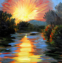
I like the painting that I did this morning, which I call Pink Champagne Sunrise.

I don't always like what I do and occasionally scrape the paint off my painting surfaces. At times like this I wonder why I am crazy enough to try and be an artist. 

I like Pink Champagne Sunrise  because of its strong value contrasts, abstracted simplified forms, and it's impasto texture. I got the texture by applying the paint with a palette knife.

I started using the palette knife because I am trying to use bolder simplified forms and trying not to overwork my paintings. When I get down there, close to the painting surface, with a small brush, I tend to move the paint around and around and add too much detail: I get lost in the forest for the trees.

I am looking forward to doing many more paintings before school starts, but I know that I am also going to want to paint the fall with its varied colors: cadmium yellow, cadmium red medium,  alizarin crimson, moss green, ochres, and orange--as well as other colors.

Now, I need to get out there while I can and chase the summer sun!

Tuesday, August 2, 2011

Knife Attack!

Last night, I did two paintings: one was very small (2" x 2 3/4"), which I overworked and the other was slightly larger 4" x 4' and turned out better, being stronger and abstracted.

I painted both of the paintings with a palette knife--no brushes!

I hunched over the smaller sized painting for almost an hour and consequently put in too much detail,
then, as I was packing up, the sun dropped even lower over the hills and the sky turned a burnt orange with some reddish scatttered patches; the hills went from a greyish-orange to a blue color.

I couldn't walk away from that!

I dug through my pack and pulled out a 4" x 4" wooden art panel and began slashing at it with my palette knife.

At first I didn't even care whether or not the painting worked out, but when it did begin working my main concern was to stay out of the way and let it just develop.

Finally, I reached the point where I dare not touch it and I knew I was done.

I packed the finished paintings into a cigar box and rode away.
Behind me the hills had turned into dark sillouttes and there was only a slight pinkinsh color in the Prussian blue sky.
The air smelled of mint, lavender, and freshly cut hay and grass.

I felt happy as I rode my bike with my paintings packed safely on the back. Happy that I had decided at the last minute to ride out into the West Eugene Wetlands to paint the sunset.


The first, smaller painting.


The second painting.


Saturday, July 30, 2011

The Van Gogh Canvas Attack

My current "project"--my goal--in painting daily is that I will loosen up my hand in painting and get more comfortable with it. I am comfortable and confident drawing, but I am intimidated when it comes to painting.

 I did two paintings on Friday morning, 07-30-2011. They are entitled Cheshire Sunrise I and Cheshire Sunrise II. These paintings are good examples--in my opinion-- of my hand beginning to loosen up and my brushstrokes becoming more bold and confident.

One reason these paintings turned out this way is because I was racing to transcribe the sun as it came through the trees and headed up into the sky--I didnt have time to tighten up and plan and get really precious and precise.

I love these fast attacks!


Cheshire Sunrise I


Cheshire Sunrise II


I am reminded  of what I read in The Yellow House: Van Gogh, Gauguin, and Nine Turbulent Weeks In Arles. In this marvellous book the author, Martin Gayford, describes Vincent van Gogh's Sabre--slashing--attack of the canvas with brush and palette knife.

I am no Vincent, but I think I can learn from this Sabre Attack in which I just get the paint on the canvas instead of laying it down then pushing it around here and there.
One tendency that I have had is putzing around with the paint until I overwork the canvas and make a mess.

Please wish me luck as I work on my artist's project.


Saturday, July 23, 2011

Sunburns, Wetlands, and Painting The Big Blue Sky


The Big Blue Sky
Pastel on Canson's pastel paper
9" x 12"


I got sunburned on my face, hands, and feet doing this pastel painting. I forgot to take sunblock and my big straw hat.

On the bright side (pun intended) I found a new place for finding motifs--interesting and beautiful places to paint: to the west of downtown Eugene Oregon are wetlands and wildlife refuges. I can even get there by bike because the bike trail runs all the way through these beautiful areas.

Next time I go there I will go closer to sunset and not again at mid-day.


Sunday, July 10, 2011

Charcoal: The "Gateway Medium"


I have been doing a lot of painting outside. This is called painting in the open air or en plien-air. (En plein-air means "in the open air", in French.)
The French Impressionists such as Monet, Renoir, and Pissaro are the ones who brought painting in the open air into the forefront as a painting phenomenon.

Painting en plein-air is very new for me. Also my subject matter has changed from works of imagination and portraits to landscapes. My work is brighter now and in color and I am using oil paint and pastels.

The road to pastels has been interesting and exciting. I started down that road started when I switched, in drawing classes, from graphite to charcoal.
 Charcoal, for me, was a "gateway medium".

Doing landscapes in pastel began in my Intermediate Drawing class (at Lane Community College in Eugene Oregon) when we were asked to go outside and draw a landscape. I thought that I would try a sepia (reddish brick brown) and umber (dark coffee brown) colored charcoal. It just seemed more natural to use earth colors for a landscape than use black--which rarely occurs in nature.
The resulting drawing is below.
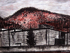

My first landscape


When I did this drawing I realized how much I enjoyed drawing nature from direct observation.

Then I watched a YouTube video in which David Hockney talked about how he was doing sunrise landscapes with a paint application on his iPhone. I loved the look of the sun and colors that he did and the next morning when I got up the sun was rising over the treetops. I didn't have an iPhone and I needed to hurry and grab something which would enable me to render the quickly rising sun; I grabbed a boxed set of Rembrandt pastels and drew the sunrise. Here is the drawing/painting:


A morning sunrise rendered with Rembrandt pastels.
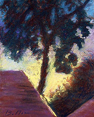

This was my first full color landscape--I was hooked!

There was no way I could have mixed paint in my palette and then painted the racing, rising sun. I found out later that this same sense of urgency to capture light is what caused Monet to do his "impressions".
This sense of urgency that painters feel is called "chasing the light".


The pastel painting below was the first landscape I did where I intentionally took my pastels and went out to paint a landscape. It is of a stand of trees at a nearby golf course.


I thought I would try to paint a landscape with acrylic paint and the painting below is a painting of a tree in the Owen Rose Garden.


 I am still trying to fall in love with acrylic but we have an on-again-off-again relationship. This small acrylic painting on a wooden panel just sold and will soon be in a private collection. I will miss it because I like how it makes me smile when I look at it.


I recently spent four days in the woods at my parents house. I took my pastels and drew this sunrise as the sun came up over the mountain.


I also took to their place a big book of the complete works of Vincent van Gogh. I learned in college that a way to excel as a painter is to copy the Masters--Vincent copied the masters who went before him--so, I did a few pastel copies of van Gogh paintings. Here they are:


Copying the work of  beautiful and brilliant Vincent van Gogh was a real pleasure. He is one of my favorite artists. A good book about him--a biography--is called Lust For Life. It was written by Irving Stone.


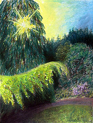
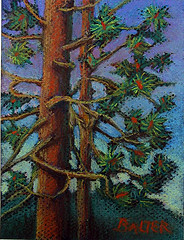
I did the pastel painting of the pine trees after I had copied Vincent's paintings and I think that his style influenced me a little. I used brighter color than I do usually. By way of illustration, compare this pine tree painting to the sunrise at my parents house, which I painted before I did the Vincent's. Can you see how I brightened my color palette?


I want to end this entry with the latest pastel painting I did. I drew this one from my imagination but it is a landscape--


Hopefully, there will be many more works of art to show you--I am painting like a madman this summer!
I am excited about painting in the open air and about my discovery of pastel painting.