Sunday, September 25, 2011

The Whiteaker Train Tracks--Original Pastel Painting


The Whiteaker neighborhood in Eugene Oregon is filled with interesting sites and people.

An interesting site to an artist is called a motif.

I saw this motif as I was riding my bike towards home. I had just passed the mural at 4th and Monroe--the one painted by Kari Johnson--and as I crossed the railroad tracks I looked both ways for the possibility of oncoming trains, then I saw the sunset and stopped. It was like seeing a fireworks display!

Another bike rider looked over and saw the sunset and slowed down but continued riding. At that moment I was glad that I was an artist and could capture what will only be a dim, self-contained, memory in the other rider's mind.

I dug out my pastels and began scumbling away on pastel paper.

 Now, I can share with you the sunset over the train tracks in  "The Whit"--The Whiteaker neighborhood.


The Whiteaker

Friday, September 23, 2011

The Still Waters: A Printmaking Experience

I had a great printmaking adventure!

I went to Tukwila Washington--20 minutes outside of Seattle-- to Sidereal Fine Art Press, where I spent four days making a series of prints.
While there I worked with the printmaker Sheila Coppola--who is a skillful printmaker and a delight to work with.
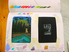
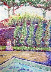
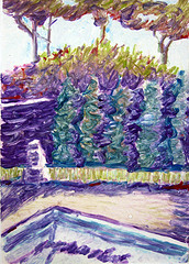
Here are some photographs of the results.


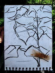
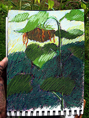
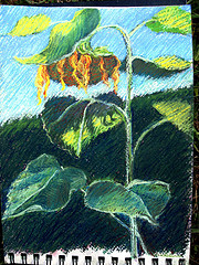
From my sketchbook: the color and value study.


The thumbnail.


The value study.


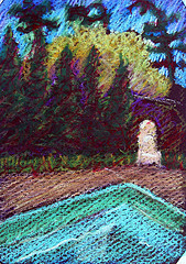
The color study: a pastel.


Softground etching.


Monotype.


Print.


Monotype.


Monotype.


I had a wonderful time at Sidereal Fine Art Press and I learned a lot about sugarlift, monotype, and working in softground.

Monday, September 5, 2011

Ah, Sunflower! jigsaw puzzle

Ah, Sunflower! jigsaw puzzle

My Teachers: Monet, Cezanne, and Vincent van Gogh

I realized today--as I was looking at the works of two of my Teachers, Monet and Cezanne, that I need to add more dark blue into my greens, when I want them to be darker.
Of course I knew this because on the color wheel green darkens to blue-green and then goes to blue. I knew this and yet when painting I wasn't fully utilizing the theory.

I like Monet's (an Impressionist) use of the brush--his paint handling, and his use of optical mixing such as when he puts yellow and red next  to each other to make an orange. Optical mixing was one of the innovations of the Impressionists.
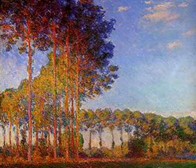

In this painting by Monet we can clearly see his use of blue to create shadow and model form.

What I like about Cezanne ( a Post-Impressionist) is his more formal structure in his paintings--the forms help the painting hold together and not become soupy. (Monet often creates a soup--but what beautiful soup he makes!)  There is an underlying strength in Cezanne's compositions. I also like how Cezanne blurs the edges of trees and rocks so that he is not creating those blasted outlines that Vincent van Gogh often used. Cezanne also softens his "outlines" by using dark blue rather than black and since blue is a cool color the edge recedes in the picture plane thus rounding the form. Cezanne is a Master of using warm colors to cause his forms to advance on the picture plane (the surface of the canvas) and cool colors to cause his forms to recede on that same picture plane.


Look at Cezanne's strong composition and his use of dark blue to create shadow!

Since I criticized Vincent's use of the black outline I will say that every painter can learn from him about the use of vibrant, complementary colors; the technique of impasto--which gives such a rich texture to a painting; and probably most important of all Vincent (a Post-Impressionist) put feeling into his works. Vincent--one of my favorite artists of all time--could make a flower look as though it was weeping or singing.


 Vincent van Gogh here uses a lighter, but still cool, blue to show the shadowed side of the willows and some shadow in the tall grasses at their base.

 These three, Claude Monet, Paul Cezanne, and Vincent van Gogh are my current teachers. I could add Mark Rothko but that will have to wait for another day.


In this painting I (Daniel Balter) used some blue in the shadowed areas of the trees but I could have used more.


In this painting I (Daniel Balter) almost completely forgot to use blue--I am still learning!


Sunday, September 4, 2011

Extreme Painting!

Painting in the dark is a challenge!


This is my first plein-air (open-air) night painting. 

 I am wearing an Energizer 4 LED Headlight and used my Guerrilla Painter ThumBox to carry my paints, palette, and canvas boards.

The painting site was my spot along the Willamette River in Eugene Oregon.

I rode my bike along the bike trail to reach the site and passed a 1000 houses from which I could see emanating the blue-glow of TV and computer screens.

It felt good to be outside, on a special mission to capture a scene.

Sometimes I pretend that I live in a time where there are no cameras and the only way I can capture a scene is by creating, by hand, images.

Sometimes I pretend that I was born without the ability to speak words and the only way I can communicate is through images.

I love painting and I love being outside and this is what drives me to go outside in the open-air to paint--
even in the dark!


Friday, September 2, 2011

Cezanne's Carrot

Paul Cezanne, one of the great Post-Impressionist painters, once said, "With an apple I will astonish Paris."

He is also reported to have said,“The day is coming when a single carrot, freshly observed, will set off a revolution.”

Cezanne did indeed astonish Paris and set off a revolution; and he is now considered the Father of Modern art.

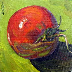
I used Cezanne's methods of using warm and cool colors to create form (warm colors advance on the picture plane and cool colors recede), when I painted this tomato.

For example, instead of using black to create shadow, I used cool greens, cool dark blue; and a cool red for a complementary color in the green shadow.
Also, I also used a violet (a cool color) under the edge of the tomato to push back the bottom edge.

See Impressionist color theory online for more information of this fascinating topic.


I am no Paul Cezanne and I painted a tomato rather than an apple, but I think that my painting is better off for having been painted in a Post-Impressionist manner.
Thank you,Paul Cezanne for your contribution to art.

You can purchase this painting by direct email to me at mailto:dkbalter@comcast.net or on my Etsy shop account:.net